How we redefined online dating for a new target audience.
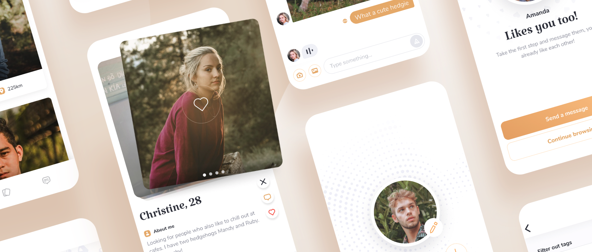
Challenge: Designing and developing a dating app for “classy 30+ singles”
Pre-kick off stage
The first step in our design process was to define the scope of the project, which helped us in determining our goals for the creative process later down the line. To decide what the priorities for this app should be we used a previously prepared questionnaire, which contained fundamental information about the project such as our client's stylistic preferences, target audience, and business data on competitors. Additionally, the client also provided us low-fidelity wireframes to portray the key features of the app.
The scope
Using this basic information we were able to define the scope of the project – based on popular dating services that target young people like Tinder or Badoo, our task was to create an online dating solution for older, more affluent, people who have active career lives and tend to be more interested in establishing long-lasting relationships and friendships.
An unusual target audience for this type of service required an entirely different approach design-wise. We had to recreate several popular features from conventional dating apps, which are popular primarily with young people, for a new type of users.
Wojtek, UI/UX designer
Analysis stage
Discovery stage - first things first
During this stage, we set out to research every aspect of the service that would be helpful during the design process. We studied our primary competitors. We defined what our users would be like, what problems they might face, and what questions they might ask. This knowledge was helpful later in the design process when it was time to prioritize features.
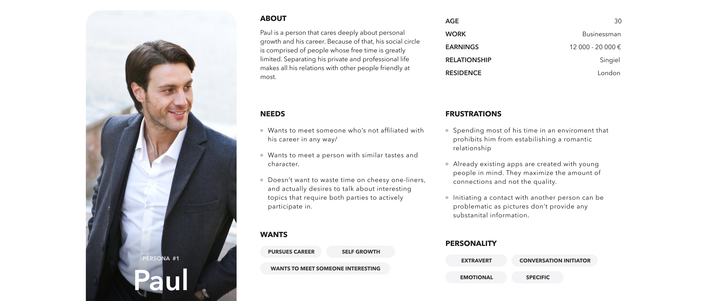
The first step of this process was defining personas - basic representations of our eventual users. Personas were an important element that helped us pinpoint who we were designing for. They enabled us to define what the target audiences problems, needs, and motivations really are.
User types
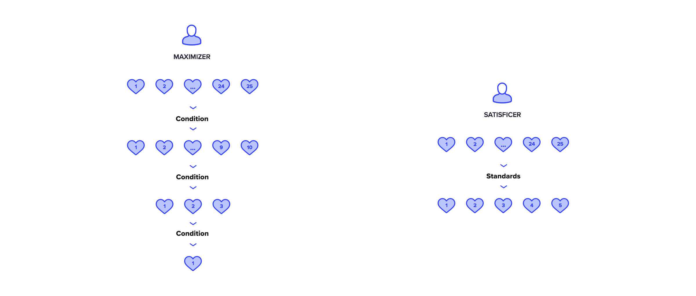
According to economist Herbert Simon, when faced with a choice consumers can be divided into two types. Consumers of the first type, labeled as maximizers, make decisions based on intense research and comparisons. The individuals making up the second group, known as satisficers, make decisions based on a certain acceptability threshold. We decided that this distinction between users would be a key factor when designing our product.
Competition analysis
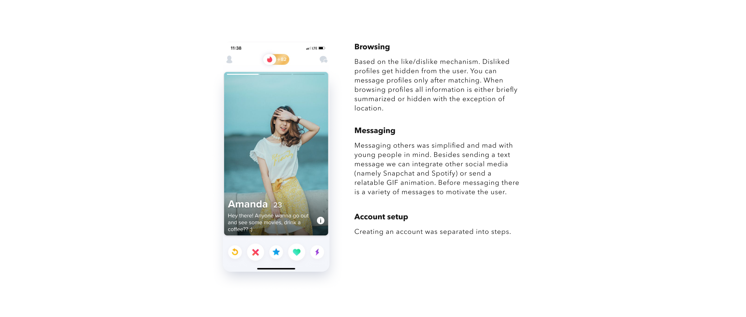
To research apps that already exist on the market, we used a usability evaluation method called cognitive walkthrough. This method requires the evaluator to and complete a set of tasks from the perspective of the user to determine the strengths and weaknesses of a service.
Defining problems and solutions
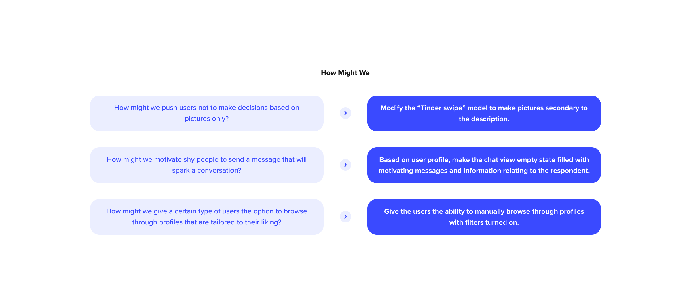
The "How Might We" Template
Defining users and examining the competition let us generate a list of various challenges the target audience might face. To find a myriad of innovative solutions to those difficulties, we framed them as "How Might We" questions and began answering them.
Unique Selling Proposition
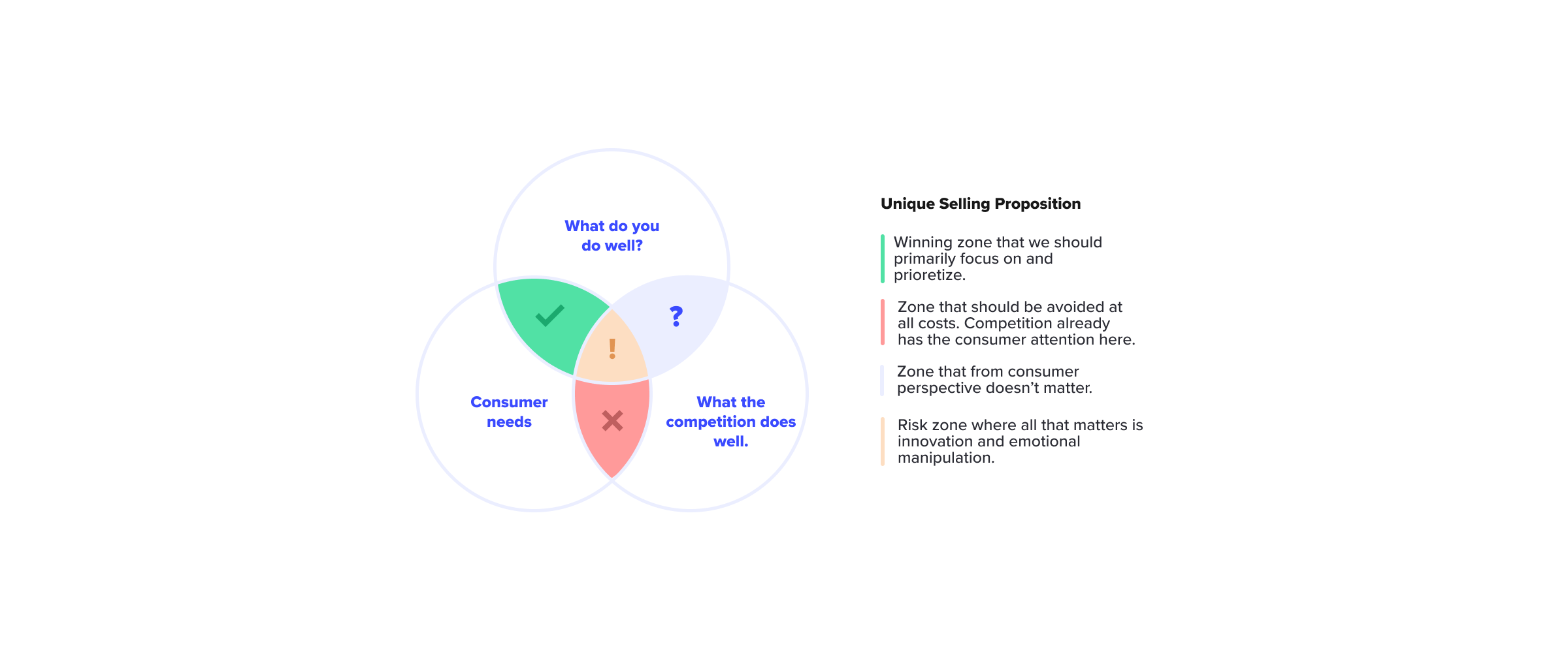
Unique Selling Proposition Template
Finding a unique selling proposition is essential when prioritizing features. Unique Selling Proposition, or USP for short, is a benefit the user receives exclusively through the usage of our product. The ability to access the service via a web browser is one such unique selling proposition.

ESPs in our app. The user “gets closer” instead of only creating an account. The user doesn't just start a conversation instead, they initiate “everything”.
While USP serves as a logical reason to use our service, it's also necessary to set up the Emotional Selling Proposition, ESP for short. Establishing our ESPs is essential when we strive to make the user feel a certain way.
Designing
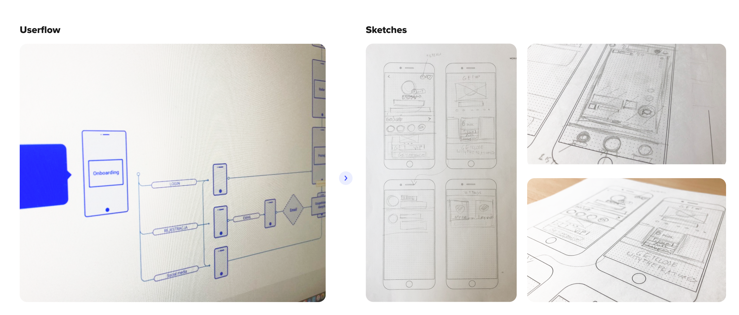
The design process begins.
The last steps before moving on to proper wireframing included creating a mood board, designing a user flow map, and sketching key screens on paper. We had to make sure that all the previous research was taken into account during this stage.

Profile view in different completion stages (sketch, low-fidelity wireframes, high-fidelity designs, prototype)
After sketching everything, we moved on to design low-fidelity wireframes. They’re purpose was to verify the usability of previously established concepts without taking too much time to create them. Additionally, they allowed us to quickly create interactive prototypes to validate different concepts through a series of tests.
The results
Two viewing methods
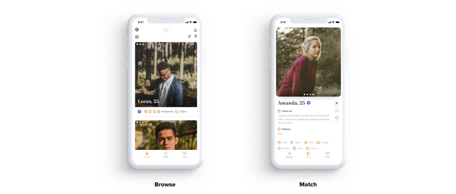
In accordance with our conclusions regarding types of consumers, we designed two ways of browsing through profiles.
Browse – this browsing method is for maximizers – people who want only the best and are willing to spend time comparing various profiles and making sure everything meets their high standards. Browse view lets maximizers freely examine profiles and filter out users with unwanted characteristics.
Match – this browsing method was designed with satisficers in mind. It draws heavy inspiration from popular apps like Tinder, which streamline the process of searching through their database by presenting profiles as swipeable cards stacked on one another. To guarantee our users don't make decisions based purely on profile pictures, we made sure that at least half the screen is filled with neatly organized and easily readable profile descriptions.
Motivating to message

Another key feature of the app was sending messages, since this is the method by which most of our users are primarily going to interact with each other. We try to mot ivate the user to start a conversation on many different occasions when using our product. The first time is right after matching (mutual like). We encourage interaction by leaving a short note about how good of an idea it is to take the first step as the other person already decided they appreciate the user. The chat views empty state was also specifically designed to motivate the users to message each other. To help people find a conversation-starting topic, we display different boxes containing information that relates to the other person's interests.
What does the client say?
We recommend working with JCD – our collaboration was professional and the project we received was well-thought out. We spend a lot of time on meetings where we set goals and defined priorities together. We appreciate how committed to the project the team was and how they kept making sure it meets not only our standards of quality but also those of future users.
Newsletter
No spam - only valuable content!:
