There are plenty of reasons to use NativeScript developing your mobile app. After explaining my rationale behind choosing {N} for our projects the time has come for you to join me on a little adventure - don't worry, I'll be your guide. I want to show you step by step how to go from zero to a simple app of your choice.
Recently, for purpose of this tutorial, we have developed a sample app called Restaurant Finder. The app’s purpose is to find the nearest restaurant to the requested location in a given category. Obviously it’s not a competitor for Google Maps app, but it’s just a showcase of the possibilities NativeScript framework gives.
Complete application consists of four screens:
-
Home screen, where the user can select the location for further search. The app requests for a location permission. When granted, two buttons show up - redirection to categories screen or to the place search screen.
-
Optional place search is simply a Google places autocomplete form for finding an address.
-
Categories let the user choose from one of predefined categories of restaurants to find.
-
Result page presents a map with route from user’s location to the found restaurant with additional details about the place.
In this tutorial I will present the first, simple screen with a nice animation revealing screen’s content. The location feature will be covered in the next, standalone tutorial. To keep things simple I will use NativeScript Playground. It allows new users to get things running right away without any hassle of setting up the local developer environment. Another huge advantage, especially for Windows/Linux users, is the ability to test iOS version of the app, a feature unavailable locally.
The markup
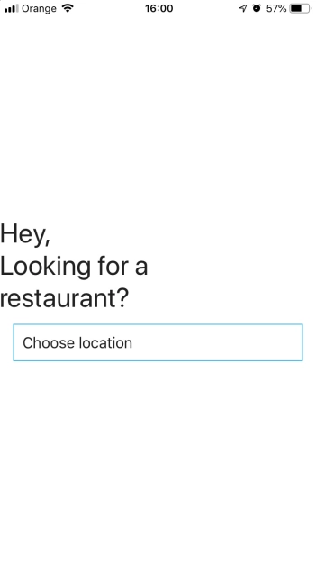
First, open NativeScript Playground and create new NativeScript + Angular project. At the left side panel we can see the base app structure. We will use the default home component. The end result will look like this:
Let’s cleanup the default layout markup by removing ActionBar tag and ScrollView inside GridLayout. We will use only one container in our view and it will be the GridLayout we have left (I covered some best practices of creating the layout here). The same effect can be achieved with Flexbox container and I encourage you to play around with it later on.
The layout has a background Image, a label and a button with a small icon. The label is spread in three lines of text. You have 3 options here - use three labels, use encoded new line character ‘
‘ (don’t forget the semicolon!) or use FormattedString. The best option which gives the flexibility for future translations to different languages would be using the encoded new line character. Don’t forget to set Label’s textWrap attribute to true. Below the Label add a Button component and add the appropriate text value. We end up with two rows that should take up minimal space. Add two ‘auto’ values to GridLayout rows attribute and assign row indexes in our elements. To position them set verticalAlignment attribute to center.
After adding some default NativeScript theme’s classes the screen should look like this:
Your Playground project should look like here.
For the icon inside our button we will use iconfont. FormattedString is our top choice for this kind of stuff. It’s a wrapper element inside Labels, TextFields and Buttons which contains Span elements. This gives us the possibility to use different classes for our text chunks. Check out this great article about using custom fonts and icon fonts on the NativeScript official blog.
Remove text attribute from Button and add FormattedString tag between opening and closing Button tag like it was a container.
Next, create a new folder in your app project structure menu on the left named ‘fonts’. Just hover over the app folder, click on the small three dots button that appeared on the right and click ‘Add folder’.

Do the same thing for the newly created folder but this time, from the dropdown menu choose ‘Upload resources’. Head for the FontAwesome webpage and download the iconfont. Find the ttf file inside the ‘webfonts’ folder from FontAwesome package and upload it to your Playground (I’ve found that fa-regular-400.ttf doesn’t work properly, use fa-solid-900.ttf instead). You want to have access to our new iconfont globally so let’s add a new class to app.css.
To finish up the look of the screen, add margin to Label with ‘m-x-16’ class and add some styles to button.
Background image
I have prepared a fancy image background using some free icons from flaticon to give the app a nice look. You can download the image here and upload it to your playground project directly or create a folder for it.
With our current layout structure adding the background image is not straightforward. The GridLayout occupies only the minimal amount of space on the screen. To change that we can add two extra rows taking maximal space like this: rows="*, auto, auto, *". Notice that verticalAlignment is redundant now.
Place the Image element before Label. The order matters - especially in iOS. If we place the image below the Button it will cover other components. Remember to set the row index, rowSpan property and to cover the entire visible space add stretch="aspectFill".
If you are testing the app on iPhone the layout seems ready but on Android, the system adds default ActionBar item on top. To remove it go to home.component.ts, import Page from tns-core-modules/ui/page, inject Page in the constructor and set the page’s actionBarHidden property to true.
You can check the current state of the project in this playground. Your screen should look like this now:

Final touch
To complete this tutorial, let’s add a final touch - a reveal animation with CSS. Add ‘home-page-content’ class to your GridLayout.
Because this animation will be only in this component we can encapsulate it inside home module meaning we will define the CSS class in home.component.css file. Replace the current CSS content of this file with the code below:
Here, we defined our class passing to it the animation defined below with keyframes. Then we defined some options of the animation playback like duration or number of repeats. The keyframes definition of our animation describes some properties of the class that changes smoothly over time. Save the project and say wow to your cool looking app’s home page.
You can find the final code here.
Newsletter
No spam - only valuable content!: